In this very first post of PIC16B, I will demonstrate how to visualize the Palmer Penguins data set with the help of panda and seaborn which is a data visualization library based on matplotlib.
Data Preparation
First, we need to load the data set using read_csv() function from panda.
1
2
3
import pandas as pd
url = "https://raw.githubusercontent.com/PhilChodrow/PIC16B/master/datasets/palmer_penguins.csv"
penguins = pd.read_csv(url)
As one may spend some time to scrutinize the data set, it can be easily seen that there are several variables that has a very low correlation or even not at all correlated to other features presented. Experiences of working with data and specifically with this data set for the mini-project in PIC16A can be very useful here as it can help us with which features to choose. Notice that we can immediately disregard quite many “irrelevant” columns like Comments, Individual ID, Date Egg, etc in this context.
1
2
3
4
cols = ["Species", "Island", "Culmen Length (mm)", "Culmen Depth (mm)",
        "Flipper Length (mm)", "Body Mass (g)", "Sex", "Delta 15 N (o/oo)",
        "Delta 13 C (o/oo)"]
penguins = penguins[cols]
Then, let’s take a look at the first few rows of our data set.
1
penguins.head()
| Species | Island | Culmen Length (mm) | Culmen Depth (mm) | Flipper Length (mm) | Body Mass (g) | Sex | Delta 15 N (o/oo) | Delta 13 C (o/oo) |
|---|---|---|---|---|---|---|---|---|
| Adelie Penguin (Pygoscelis adeliae) | Torgersen | 39.1 | 18.7 | 181.0 | 3750.0 | MALE | NaN | NaN |
| Adelie Penguin (Pygoscelis adeliae) | Torgersen | 39.5 | 17.4 | 186.0 | 3800.0 | FEMALE | 8.94956 | -24.69454 |
| Adelie Penguin (Pygoscelis adeliae) | Torgersen | 40.3 | 18.0 | 195.0 | 3250.0 | FEMALE | 8.36821 | -25.33302 |
| Adelie Penguin (Pygoscelis adeliae) | Torgersen | NaN | NaN | NaN | NaN | NaN | NaN | NaN |
| Adelie Penguin (Pygoscelis adeliae) | Torgersen | 36.7 | 19.3 | 193.0 | 3450.0 | FEMALE | 8.76651 | -25.32426 |
Now, observe that there are Nan values floating around in our data. We certainly want to eliminate them so that the computation can be dealt with a lot more ease.
1
penguins = penguins.dropna()
Through some sets of trial and error, we can also figure out that there is an invalid value of Sex (“.”) at index 336 which can affect how the program performs. Thus, we will drop it from our data as well.
1
penguins = penguins.drop([336])
Now, in order to generate a plot, we have to borrow some help from our best companion in PIC16A, which is sklearn, to encode all of the qualitative features in our data set. Otherwise, the function can’t really deduce anything logically from data filled with strings.
1
2
3
4
5
6
from sklearn import preprocessing

le = preprocessing.LabelEncoder()
penguins['Sex'] = le.fit_transform(penguins['Sex'])
penguins['Species'] = le.fit_transform(penguins['Species'])
penguins['Island'] = le.fit_transform(penguins['Island'])
Visualizing with Seaborn
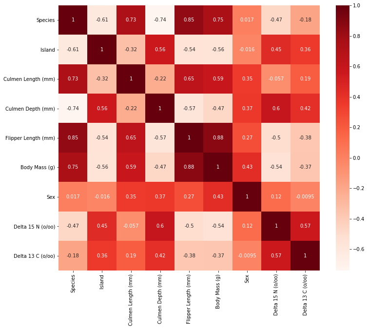
At this point, there are different paths that we can take to visualize the relationship between various variables in this data set. As some of us may recall from the mini-project in PIC16A (with Professor Chodrow), we have to perform feature selection to get the best combination of variables that maximizes a machine learning model’s ability to correctly predict a penguin’s species. With that being said, in this blog post, I want to construct a plot that showcases the correlation between each variables in our data set using the heatmap method from seaborn. This would certainly give us a very comprehensive picture of how each variable is related to the others.
In fact, when working on the project, my groupmate came up with this ingenious idea to systematically select the best features for the model. Thus, the code that I am about to show here is credited to Emily Nguyen; thank you for all of your hard work throughout the quarter.
1
2
3
4
5
6
7
8
9
import seaborn as sns
from matplotlib import pyplot as plt

plt.figure(figsize=(12, 10))
# create a panda dataframe consisting of the pairwise correlation between all variables
cor = penguins.corr()
# plot the correlation coefficient on a heatmap
sns.heatmap(cor, annot=True, cmap=plt.cm.Reds)
plt.show()

Observe that we mapped the correlation levels on a heat map in order to visualize the relationship between any two features, in which the darker red implies a more positive correlation. On the opposite spectrum, the white region signifies a more negative correlation. However, those negative values are not necessarily labeled as the undesirable features for our model. In fact, they hold the same “credentials” as those positive ones because what may happen here is that two variables may have an inverse relationship in which an increase in one variable leads to the decrease of the other. What we really want to ignore from the heat map are those sets of variables with coefficient close to 0 with respect to species. These features do not contribute helpful information or an indicative trend in determining the species of a penguin.
